Creating an org chart is a great way to foster collaboration across teams in your organization. Learn how to create an organizational chart of a company by reading on or jumping ahead to the section that will help you most:
To follow along with these tutorials, make sure you've added Gliffy to your Confluence space! You can start a free trial in just a few clicks.
Back to topWhat is an Org Chart or Organizational Chart?
An org chart or organizational chart is a type of diagram that conveys a hierarchical structure detailing roles, relationships, or responsibilities within the structure. They're used most often to describe the structure of a company or business, but a family tree could also be an example of an org chart.
These diagrams help you visualize the people or elements of your organization and the relationships between them, which means they improve connection and understanding across teams. By adding organizational charts that your team can reference, you'll increase collaboration and can improve team productivity.
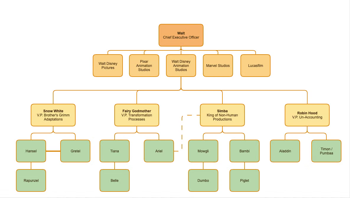
While most people use org charts to visualize the management structure of a business, they can illustrate any hierarchical system. You can use them to display how the topics in a field of study are related, to explain which spin-offs sprouted from which television programs, or to map out family trees.
Creating an organizational chart — and making it look professional — takes only minutes when you use an org chart creator like Gliffy. You can sign up for a free trial of Gliffy to make your own in just a few clicks.
Back to topHow to Make an Org Chart: Video Tutorial
This tutorial covers the basics of making organizational charts with Gliffy's easy, drag and drop diagramming software. Read on for step-by-step, written instructions.
Step-by-Step: How to Create an Org Chart with Gliffy
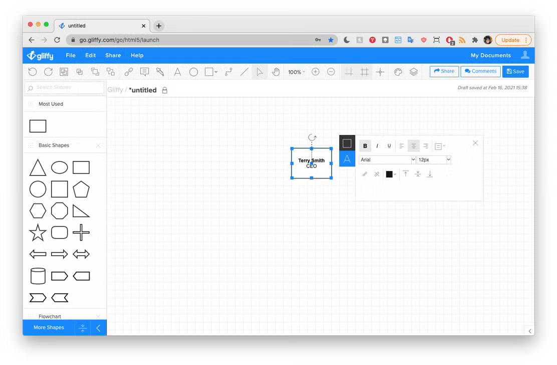
Step 1: Start at the Top
Most organizations have one person in charge, such as a CEO. That role or person will be the top of your chart, with roles and power flowing down the diagram from there.
Open the Gliffy editor and, in the left toolbar, locate Basic Shapes. Drag a rectangle to the top center of your canvas and simply type in whatever title or text you want to appear in the box. You can edit this text by clicking the box and clicking the A icon to open the text editing menu. The first box usually includes a job title and the name of the person holding that title.
Step 2: Add Tiers and Show Reporting Structures
Next, drag in rectangles for each second tier manager or person that reports to the top level and place them below your top-level rectangle. Use the Connector Tool to link your top rectangle with each of the rectangles in the second level.
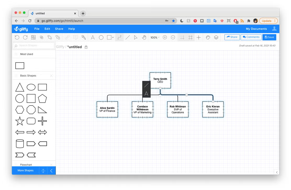
Beneath each of these managers, you’re going to repeat the process to include all the people who directly report to each second-tier manager. Then do the same thing for those that report to those people and so on until you’ve got your whole organization plotted out.
Step 3: Generalize to Fit Your Audience
If you have a lot of employees to diagram you may quickly find it necessary to abandon the horizontal, expanding pyramid structure for a more compact style, which combines a horizontal layout with a vertical one. In this variation, all employees linked off of the same descending line are considered to be at the same hierarchical level. Laying out an organizational chart this way saves a ton of space.
But, also think through whether you need to include that much detail. Is this chart for your investors to understand the overall structure of your company? In this case, you could also choose to generalize and, rather than documenting every person with an "account executive" title in the sales organizations, add a box that simply includes that job title. Knowing your audience will help you select the right amount of information to include.
Back to topAdvanced Org Chart Examples
As you build out your chart, you may encounter a few situations that you’re not sure how to diagram.
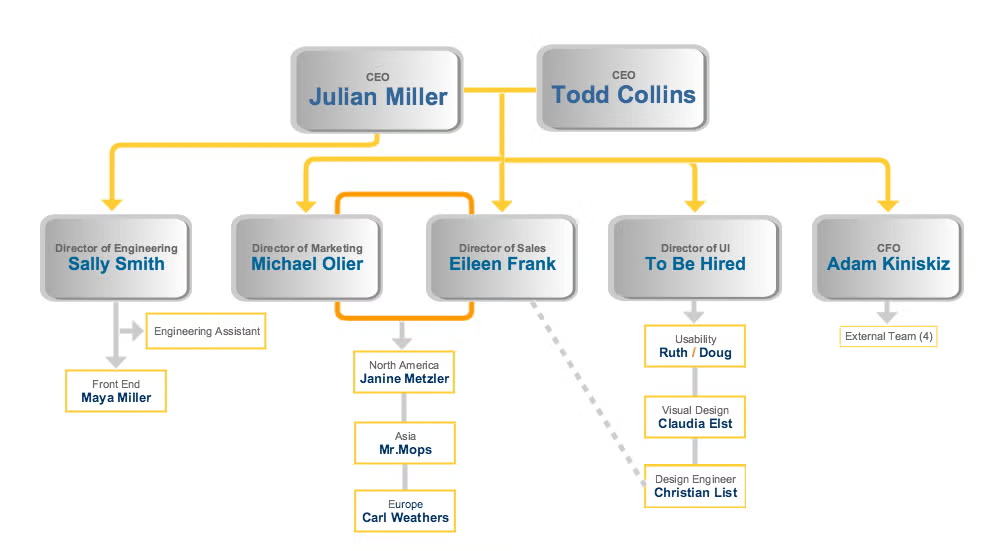
Designate Open Positions
If your organization has an unfilled position, you should still include it in your diagram. Drop in a box just like any other, enter the position’s title, and then instead of entering an employee’s name, write ‘to be hired,’ as we’ve done for the Director of UI position above.
Show Multiple Leaders & Managers
If your company has managers who share duties, you’ve got a few options. Most common is to place the two listings alongside each other and connect them with a horizontal line—as with the joint CEOs above. Their shared reports descend off the line that connects them, while employees who are only managed by one descend directly from that manager’s box, as illustrated above.
Other options include connecting co-managers with double lines — as seen above with the Director of Marketing and the Director of Sales.
Capture Dual Duties
If an employee primarily works for one manager, but reports to another for other duties, use a dashed line to connect that employee to his or her occasional manager while keeping them under the primary structure for their most frequent manager.
Include Personal Assistants
Personal assistants usually fall outside of a normal chain of command. They report to someone on a higher tier than other employees, but those employees don’t report up to them. Illustrate this by including personal assistants on a spur off to the side of the line that connects their manager to his or her other reports, as we’ve done with the Engineering Assistant.
Designate Shared Positions
If one position is split between two part-time employees, enter both names in the same box, separated by a slash — as we’ve done for the two employees in charge of Usability above.
Creating an Org Chart for a Large Organization
Sometimes the organization you’re trying to diagram is too large to fit neatly on one chart. If this is your situation, apply one of these solutions:
- Summarize: Instead of listing each low-level employee, group them all by title and indicate how many of them there are — as we’ve done with the External Team assisting the CFO above.
- Extend: Create a number of charts that nest together to represent the entire organization. For example, you might make an executive chart and separate charts to illustrate each department under an executive. You can attach links to the additional diagrams, making organizational charts easy to navigate between.
Why You Should Use An Org Chart Creator
Regardless of the size of your organization, your ultimate goal should be to grow it! Changing teams, updating job titles, and making sure your employees always have access to the most recent version of your org chart can be a chore.
With Gliffy, however, you can easily track versions and embed live diagrams anywhere so that your team only ever sees the most recent version of your organizational chart. Time = saved. This is one of the key features in our enterprise diagramming software that helps teams grow and scale without a hitch.
If you're nesting various organizational charts together, layers are a great way to keep everything organized. You can also link one diagram to another, which allows you to create a network of organizational charts that give viewers only as much detail as they need.
Ready to get started making your own dynamic organizational chart? Start your free trial to dig in and make your own.