Software companies aren't the only organizations that lean on diagrams to help explain complex systems. Many businesses and government departments use diagrams to explain their different processes.
The Department of Defense, for instance, is diagram-mad. Literally — if you take this general's word for it. A few years back, two diagrams from within the DoD made it into the mainstream media and were used as examples of Powerpoint-gone-mad, where overzealous bureaucrats and engineers were swamping soldiers with pointless diagrams that one general simply labelled, “stupid.”
In fact, these diagrams were anything but stupid. They were astoundingly complex, and to the layman seemed pointless. But to the experts, they were perfectly understandable. As software becomes more complex, this is a problem that any engineer can run into.
And while clarity in engineering is crucial, sometimes bridging gaps with other teams can also make a big difference—just like what happens when Engineers & Marketers sit down and collaborate more closely.
But as these diagrams show, no matter the complexity of your subject, you can strike a balance by considering the right information to include and the context to give.
Back to topComplex Processes & Their Terrible Diagrams
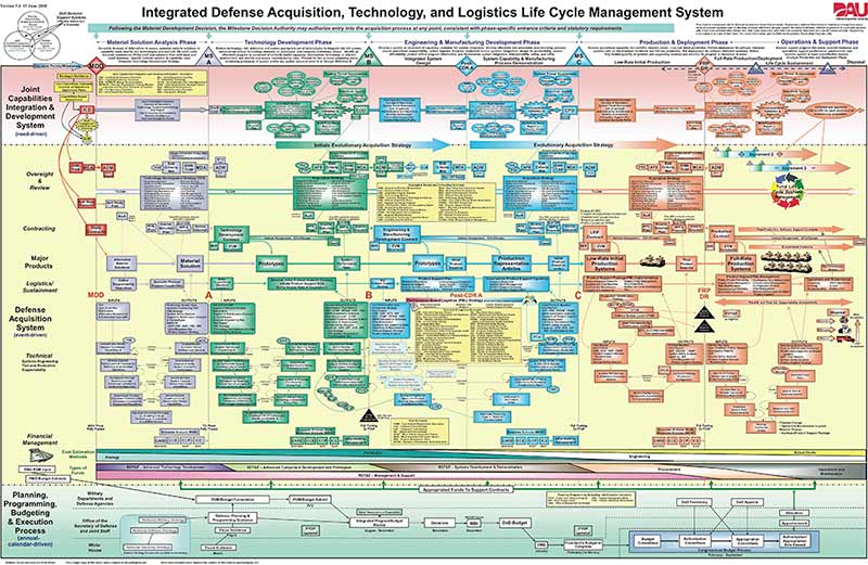
The first diagram that drew ire was one that showed the life cycle of defense equipment and materiel, pithily titled “Integrated Defense Acquisition, Technology, and Logistics Life Cycle Management System.”
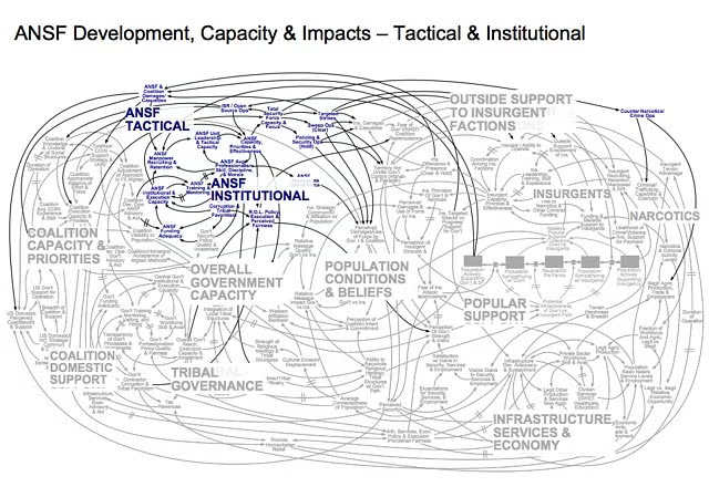
The second one was an overview of the military strategy in Afghanistan. If the former diagram is the visual equivalent of stepping on a LEGO brick, this one is more like drowning in spaghetti.
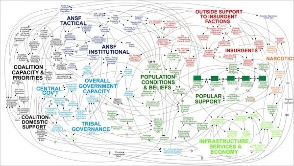
As one general put it when seeing this diagram, “When we understand that slide, we’ll have won the war.” Let's use these diagrams as examples of what not to do.
Back to top5 Tips for Better Engineering Diagrams
1. Keep Your Diagrams to a Single Page
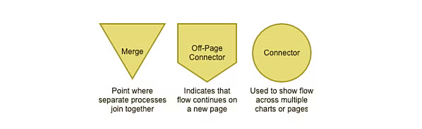
If you have to zoom in on parts of the diagram to understand its content, it's probably too complicated. If you're using Gliffy and creating a digital diagram, you can remedy this by linking to additional pages in Confluence or resources elsewhere. Or, you use one of the following connector symbols to efficiently break your diagram into multiple pages:
2. Shapes and Spacing Should Be Consistent
Your flowchart will always look more professional if you take the time to make every shape the same size and keep things evenly spaced. Our two disastrous examples above really could've cleaned up their act by standardizing those elements. If you're using Gliffy, the shapes you drag and drop should all be consistent. Make sure you've turned on Drawing Guides and Snap To Grid to help manage spacing, too.
3. Beware of Information Overload
Does all that really, really, need to be crammed into your diagram? Consider your audience as you try to edit out extra information. Maybe one team will benefit from an extremely detailed breakdown of part of the process — that could be a great resource if outlined in a different diagram or content drill-down.
4. For Styling and Design, Less is More
Don't go overboard with colors, gradients, drop shadows or borders. Removing gradients alone would make our first example so much better. In Gliffy, we made your diagram style as foolproof and pretty as possible, which templates you can apply in just one click. If you're not using a template, just stick to two or three colors and lines so that you can emphasize steps of the process.
5. Include a Key
Some symbols are pretty self-explanatory, but including a key for any extra symbols or colors is important. If you need a refresher on the agreed-upon meanings, you can check out our post about flowchart symbols.
Initially, it seems the ire is justified. These are bad diagrams. But you, and the readers of Wired and NYT are missing one vital thing: Context.
Back to topGive Your Engineering Diagrams Context
The first diagram drew so much displeasure that it was updated to this in 2014:
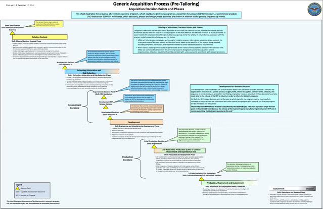
This update would seem to be a move in the right direction from the DoD and an acknowledgment that maybe they overdid it first time round. There is less clutter, a clearer flow, and it's easier to understand all round.
Unless you are involved in any part of the process. Here are some of the comments under the post announcing the release of the new version, from the people who actually needed to use it:
The new wall chart is beyond inadequate. I frequently referenced the old wall chart and was looking forward to the promised update. Compared to the previous chart, this one is a blank page. It is NOT useful. Please, please reconsider.
As a Systems Engineer, this new chart is a step backwards. The prior Wall Charts were a convenient single-source reference for the timing, inputs, and outputs of almost all acquisition related technical processes, reviews, and reports. While some made fun of the systems engineering “V’s” in the bottom half of the chart, to a good DoD Systems Engineer they provided a strong foundation for the scheduling and expected products of our activities.
If this chart is designed to be a replacement for the old, it is totally inadequate. Most of the useful information in the old chart is gone.
Beyond useless. I continue to use the old one, both personally, and when explaining process to clients.
Ouch. Those aren't good reviews. To the naive viewer, the revision is better. But to the expert viewer, it lacked the detail and nuance that made the diagram worthwhile. Instead of having something they could use, they now just had a lot of blue-gray space (though at least the gradients had gone).
When people scoffed at this in Wired, they lacked context. They weren't the audience for the diagram, so just saw it as a large collection of poorly-colored, poorly-organized boxes. But a systems engineer navigating defense acquisitions could immediately find all the information needed on that chart.
The demolition of the “Afghanistan Stability” graph also lacked context. The complex diagram that was splashed across the New York Times was a single slide of a 30 slide presentation. As David Liu of SD Wise, a blog about system dynamics, puts it:
Yes, a causal loop diagram can seem overwhelming without explanation. So is any engineering diagram without explanation. But if you are a System Dynamics practitioner, you would know that the creator of the slide would have provided additional slides that explained the diagram in detail. The full set of draft slides actually provides sufficient explanation to avoid confusion.
If you look at the entire deck, the slides preceding and the slides following this one help dive deeper into individual areas, and isolate important loops:
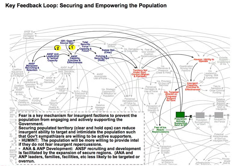
If you have an understanding of system dynamics and access to the entire deck, suddenly what looks like spaghetti becomes untangled.
Back to top3 Ways to Simplify a Complex Process
This is a tightrope. Sometimes your diagrams will be confusing for an audience, even an educated one. But, contrary to popular belief, both these castigated examples show that it is possible to build a complex diagram about a complex topic and for it to work.
To help you do so, here are 3 quick tips you can use.
1. Listen to your audience
It seems odd that no one at the Defense Acquisition University asked vendors, engineers, or colleagues whether they found the initial Life Cycle Management diagram useful and wanted it changed. If they had, the answer would've obviously been a resounding “no!”
Your diagrams are made for a specific audience. It doesn't really matter what anyone outside that group of people thinks about the diagram. As long as it gets your ideas across to your product managers, marketers, or other engineers it can be as complex as needed—within reason. When you present to them, ask for feedback—what was clear? What wasn't? Then iterate on that until you are able to present the knowledge you have in a way that transfers that knowledge.
2. Don't be afraid of your complexity
General McMaster, then Commander for Planning in Afghanistan and now National Security Advisor, was a confirmed hater of the Afghanistan Stability slide, and Powerpoint in general. Talking to the New York Times, he said, “It’s dangerous because it can create the illusion of understanding and the illusion of control. Some problems in the world are not bullet-izable.”
But in criticizing the diagram, he's actually shown its strength. When you look at it, you get the opposite of the illusion of control. With so many variables you actually get the feel for the complexity of the situation. This goes for any diagram. If you are talking about a complex idea, such as software, the diagram needs to contain that complexity to actually help the audience.
3. Keep it together
The Afghanistan Stability diagram was lambasted in isolation. When you go through the other 30 slides in that deck, you see how each of the individual components fit together. But this was lost in the takedowns in the NYT and Wired.
If your diagram requires extra information, then you have to follow one of our Top Ten Pro Flowchart Tips—Get Hyper. If it can't all fit on the page but is still important, then link through to other documents. Very few people are printing out flowcharts anymore. They can be smart documents that contain more information underneath. That way everything always stays together. That is, until it's printed on the front page of the New York Times.