Interactive diagrams enhance communication, collaboration, and decision-making by breaking down complex ideas into a hierarchy of information.
In this blog, we’ll go over some key use cases for interactive diagramming and the tools you need to create your own.
Back to top
Understanding Interactive Diagrams
What Are Interactive Diagrams?
Interactive diagrams are dynamic visual tools that allow users to engage with and explore information in a more meaningful way compared to static diagrams.
Interactive diagrams are different from static diagrams because of the interactive elements, such as clickable components, hover effects, and drill-down capabilities, that allow viewers to engage with the information they are consuming.
Types of Interactive Diagrams
Interactive flowcharts and process maps: An interactive flowchart may allow the viewer to toggle different steps of a process on and off based on the stage of the process or their role in it.
Interactive network diagrams: Interactive network diagrams allow the viewer to drill down to specific parts of the network for more detail or get a broader view of its components.
Interactive mind maps and concept visualizations: As your team is brainstorming or after the brainstorming session, break down ideas into groups of related concepts so you can focus on each theme individually.
Interactive organizational charts: Find information about specific departments or teams without needing to search through the full org chart.
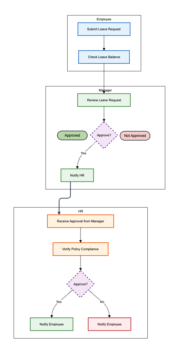 | Interactive Diagramming ExampleHere’s an example of a diagram created using Gliffy’s AI diagramming feature which you can easily make interactive, thanks to layer linking. Once the diagram has been generated, you can copy different sections of the diagram onto their own layers to apply the interactive functionality. For example, you could add interactivity to the “Approved” and “Not Approved” shapes so a viewer only needs to look at the relevant information. In this example, the "Approved” workflow is displayed. You can click the shape that says “Not Approved” to see that workflow instead. |
Core Benefits and Business Value of Interactive Diagrams
Business
Interactive process mapping enables organizations to visually document, analyze, and refine their business workflows in real time.
By leveraging interactive elements, such as clickable steps, decision points, and embedded documentation, teams can quickly identify inefficiencies, redundancies, or bottlenecks. This clarity accelerates process improvement initiatives and supports informed decision-making.
Dynamic organizational charts go beyond traditional static visuals by offering expandable hierarchies and employee profiles within the diagram itself. Users can click on a team, department, or individual to access detailed information such as roles, responsibilities, contact details, and even key performance indicators.
This functionality enhances transparency, simplifies onboarding, and empowers HR teams and managers to manage talent more effectively.
IT and Technology Management
Interactive network diagrams empower IT teams to visualize the entire IT infrastructure in real time. By enabling users to click on servers, switches, routers, and endpoints, these diagrams provide immediate access to status indicators, performance metrics, and connection paths.
Interactive troubleshooting flowcharts guide users through step-by-step diagnostic processes, adapting dynamically based on user inputs or system data. These diagrams streamline technical support by surfacing relevant procedures and automated checks, quickly narrowing down potential causes of system failures or performance issues.
As a result, support teams resolve incidents faster and with greater consistency, improving service quality and reducing downtime.
DevOps and Engineering
Interactive architecture diagrams enable technology leaders and development teams to break down complex systems into understandable components. Users can drill down into individual modules, services, or APIs, reviewing dependencies, documentation, or version histories directly from the diagram.
Focusing on individual aspects of a system enhances technical onboarding, accelerates code reviews, and streamlines cross-team collaboration. This level of clarity is especially valuable in distributed or microservices architectures.
Back to topHow to Create Interactive Diagrams: Tools and Techniques
What Tools Are Best for Creating Interactive Diagrams?
Gliffy’s interactive diagramming interface is more intuitive and faster than alternatives on the Atlassian Marketplace. Gliffy’s layer linking feature allows you to link objects in your diagram to layers, using them as a toggle to make those layers visible or invisible, with no coding required.
Interactive Diagram Tutorial
Designing an Interactive Diagram
A well-designed interactive diagram must prioritize the user's journey. Effective design starts with a clear entry point, leads into logical navigation paths, and includes easily identifiable interactive elements.
For example, use consistent button styles, icons, and tooltips to guide users through the diagram’s interactive features. Implement logical groupings of related elements and progressive disclosure—revealing information only as needed—to reduce cognitive overload and keep users focused.
A strong visual hierarchy ensures users understand what is most important at first glance. This can be achieved through strategic use of size, color, contrast, and spacing to draw attention to key components. Primary actions and critical data should be prominently displayed, while supporting information is visually subdued but easily accessible.
Interactive Diagramming Best Practices
Planning Interactive Elements Strategically
Begin by determining which elements of your diagram should be interactive based on user needs and core business objectives. Identify points where interactivity will add tangible value, such as allowing users to reveal details on demand, navigate processes, or filter data.
Testing Interactivity
Rigorous testing guarantees that interactive diagrams work correctly and consistently for all users. After creating your interactive diagram with Gliffy, you’ll want to make sure that your interactive layers are set up correctly by returning to the Confluence page and clicking on the interactive elements from the diagram viewer.
Use AI For Faster Diagramming Workflows
With Gliffy, you can create your interactive diagram faster by generating different areas of the diagram, converting each part to a classic Gliffy diagram so you can move shapes individually, and then copying components onto the correct layers.
For example, if you are diagramming a troubleshooting workflow, you can use Gliffy’s AI feature to visualize different branches of the process, then put each process flow in its own layer and add interactivity.
Watch our on-demand webinar to learn more about how AI and interactivity work together to help you build smarter diagrams.
Back to topCreate an Interactive Diagram in Confluence
Interactive diagrams represent a fundamental shift from static visuals to dynamic business intelligence tools that drive meaningful outcomes. Throughout this comprehensive guide, we've demonstrated how interactive diagrams enhance communication effectiveness and accelerate collaborative workflows at every organizational level.
The strategic applications we've explored—from interactive process mapping that optimizes business workflows to dynamic network diagrams that streamline IT operations—showcase the transformative potential of interactive visualization.
Ready to transform your static diagrams?
Discover the value of interactive diagramming with Gliffy and empower your team to create compelling interactive visualizations without hours of work.