What is a PERT Chart?
A PERT chart, or PERT diagram, is a visual representation of the timeline of a project. It's typically made and used before kickoff to evaluate the tasks, time, and resources required to complete it. In line with its purpose, PERT stands for “program review evaluation technique.”
Project managers use a PERT chart to communicate project objectives to stakeholders. That can include getting buy-in from organizational leadership, or communicating plans and priorities to the people who will be working on the project.
This type of chart is also especially helpful for determining a project’s critical path—the longest chain of events (in terms of time) that needs to occur for the project to be complete. This is especially important information for a project manager because the critical path defines how long the project as a whole will take.
Interested in learning more about PERT charts? Read on or choose the section that interests you:
Back to topPERT vs. Gantt Chart: What’s the Difference?
The difference between these two project management tools may not be clear at first. After all, they’re both visual representations of all the tasks that must be completed to finish a project. However, several differences make each chart valuable to project managers in different ways.
Visual Structure
The first difference between a PERT and Gantt chart is visual structure. A PERT chart is a flowchart, while a Gantt chart is a bar graph. You can examine the project differently based on what kind of chart you’re using.
For example, a PERT chart is a type of dependency diagram that clearly shows dependencies between project events. However, Gantt charts show a more specific view of how project activities are broken down into smaller tasks, and they are also a good way to illustrate scheduling constraints.
Flexibility of Information
Due to the nature of their visual structure, PERT charts are more flexible and customizable. They can be altered significantly based on your needs and the type of project. A Gantt chart, on the other hand, will almost always have the same format of a bar graph along a timeline.
Project Stage
A PERT chart is most commonly made and used in the planning stage, along with other project planning tools such as a stakeholder map or RACI chart. Its main use cases—evaluating how long a project will take, discovering the critical path, and communicating objectives and time frames to stakeholders—are all key parts of the planning process.
In contrast, a Gantt chart is more effective than a PERT chart for ongoing projects. One reason is that PERT charts don’t always have specific dates, while a Gantt chart does. Gantt charts are also more helpful for breaking down milestones into smaller tasks and helping team members see when specific activities should be done.
A project manager could easily use both a PERT chart and a Gantt chart for the same project, as they have different advantages and are most effective at different stages of the project life cycle. Information from the planning phase’s PERT chart can also be translated into the execution phase’s Gantt chart.
Back to topHow to Make a PERT Chart
Step 1: Identify Tasks
First, identify every task that will need to be accomplished in order to complete the project. If you want to get your team involved, you might hold a brainstorming session to tackle this step.
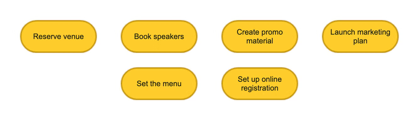
As an example, If you were creating a chart for an event you’re planning, the list of project tasks might look something like this:
- Reserve a venue
- Book speakers or entertainers
- Create promotional materials
- Set up online registration
- Plan the food and drink menu
- Launch marketing plan
Of course, planning an event is a detailed endeavor, so your list may be much longer than this, but it’s a good place to start for an example. Plus, a PERT chart doesn’t need to have every stage of the project broken down into smaller tasks, so thinking big picture isn’t necessarily a bad thing.
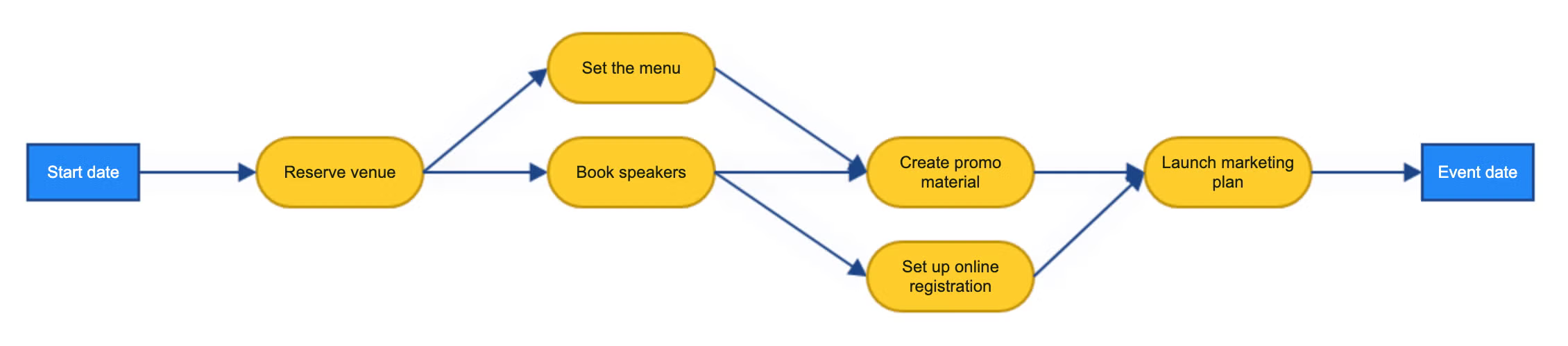
Step 2: Determine Dependencies
Make sure you understand which tasks have dependencies on others, meaning one task must be done before another can begin. You will need to show these dependencies when you make your chart, which will help you understand the project’s workflow.
Following our event planning example, carrying out a marketing plan for the event is dependent on creating the promotional materials, so your chart will illustrate that.
Step 3: Start Your Diagram with Nodes
Nodes are important milestones that represent the main activities that need to be completed in the project. These nodes are not necessarily individual tasks, because a node can represent multiple tasks.
For example, if you had a node for creating all promotional material, that could include creating flyers, social posts, emails, and maybe even videos.
Step 4: Connect Nodes with Arrows
When an arrow goes from one node to another, that indicates a dependency between those activities. Make sure to illustrate all the dependencies you determined in step 2.
There may be tasks that don’t have direct dependencies and can be completed parallel to other tasks. Use divergent arrows to represent this relationship. For example, someone could be working on setting up online registration during the same time promotional material is being created.
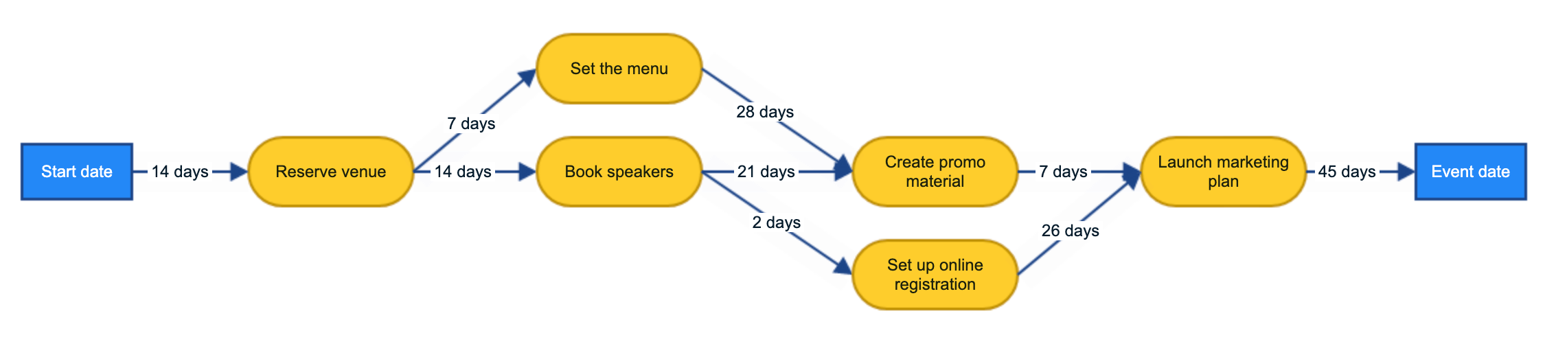
Step 5: Add Time Estimates
Estimate how much time each stage of the project will require and add this to each section of the chart. You don’t need to specify dates yet and it’s okay if the timeframe changes. This is just to give a general idea of how long each part of the project will take.
Step 6: Share With Your Team
Your PERT chart is now complete! You can launch this example as a template in Gliffy and start customizing it to fit your own project.
The final step in the PERT chart process is to use it for its intended purpose: communicating the project timeline and objectives to stakeholders. Once you get started, you can also use your PERT chart to make a Gantt chart to follow throughout the project.
Back to topKick Off Your Next Project with a PERT Diagram
Creating your PERT diagram with a diagramming tool like Gliffy makes it easy to share your work and keep everyone in the loop. You can drag and drop as many nodes as you need to customize your chart however you want. If you're using Confluence for project management, you can create your PERT chart directly in Confluence and even build it together with your team in real time. And it's free to give it a try!
With a great plan in place and a powerful diagram to back it up, your project will be up and running smoothly before you know it.