Did you know that our brains process images 60,000 times faster than text?
Humans think in pictures — that’s why it’s easier to carry a project from idea to execution when you visualize every step of the way.
Whether you’re brainstorming ideas, sharing updates with your stakeholders, or illustrating the flow of work on an agile board, visualization adds transparency and lowers the barrier for others to join in conversations. Ultimately, this helps everyone stay aligned and organized and work more effectively.
Let’s explore how you can visualize your work throughout each stage of a project’s lifecycle without ever leaving Confluence and Jira. We’ll use the creation of a new website as an example.
Back to top
Visualize Your Plan
As you’re putting together a project plan, it can be helpful to gather ideas in a group setting and use a visual framework to record ideas. The best way to visually manage brainstorming and ideation directly in Confluence is with a Gliffy diagram.
You can get the team together to share and record ideas in real time with Gliffy’s real-time collaboration features for Confluence Cloud, add as many sticky notes as you need, or sketch out a concept with the freehand drawing tool. To give users a head-start, Gliffy also comes with a range of diagram templates.
If you’re making a new website, you could add people’s ideas for what pages, menus, content, images, and links are required on the site. And if your team has an idea for how a page should look in terms of layout and design, you can use one of the templates for website building to mock it up. These have pre-built graphic elements for navigation, buttons, dropdowns, icons, and other on-page functionality.
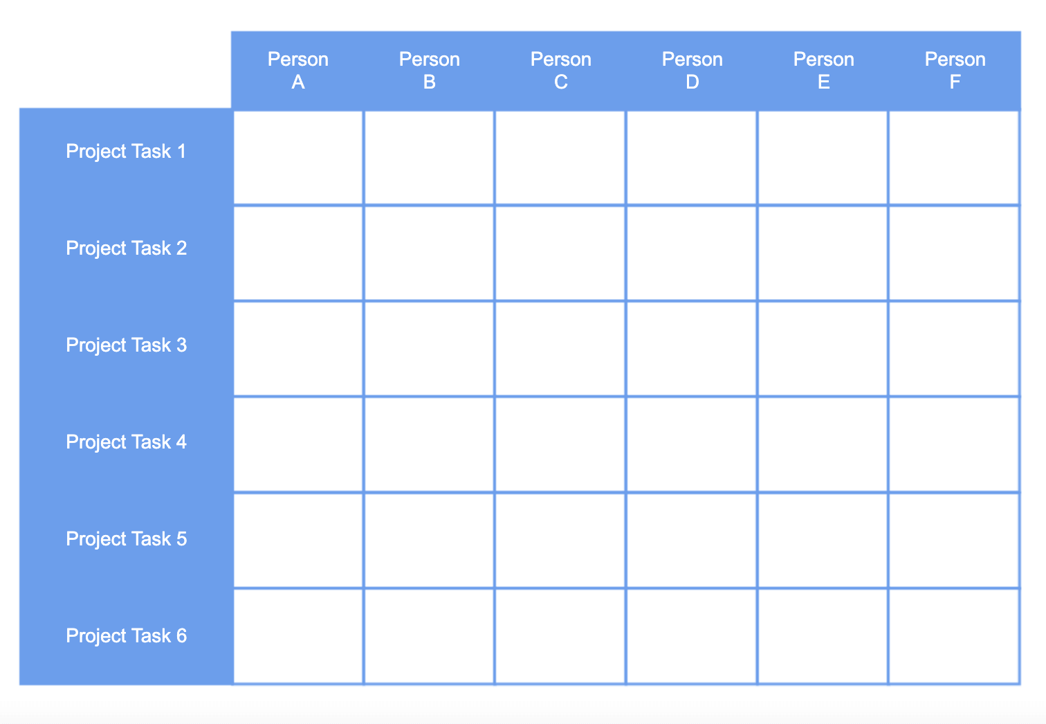
Diagrams for Project Planning
When it comes to managing a project in Confluence, there are a few diagram types that can help you document important information and reference it at a glance.
A RACI chart helps your team keep track of stakeholders and their level of involvement in the project — when should they be involved, informed, or responsible for certain steps? As you’re assigning and scheduling tasks and creating a communication plan, this can be an important reference.
RACI charts are especially helpful when you’re working with a large or cross-functional team, or when you don’t have an established process for the type of project you’re executing. A stakeholder map serves a similar purpose, but under a slightly different framework.
PERT charts are another helpful project management diagram. These illustrate the timeline of a project and are typically built during the planning stage to help the project manager discover the project’s critical path and communicate timelines and requirements to stakeholders.
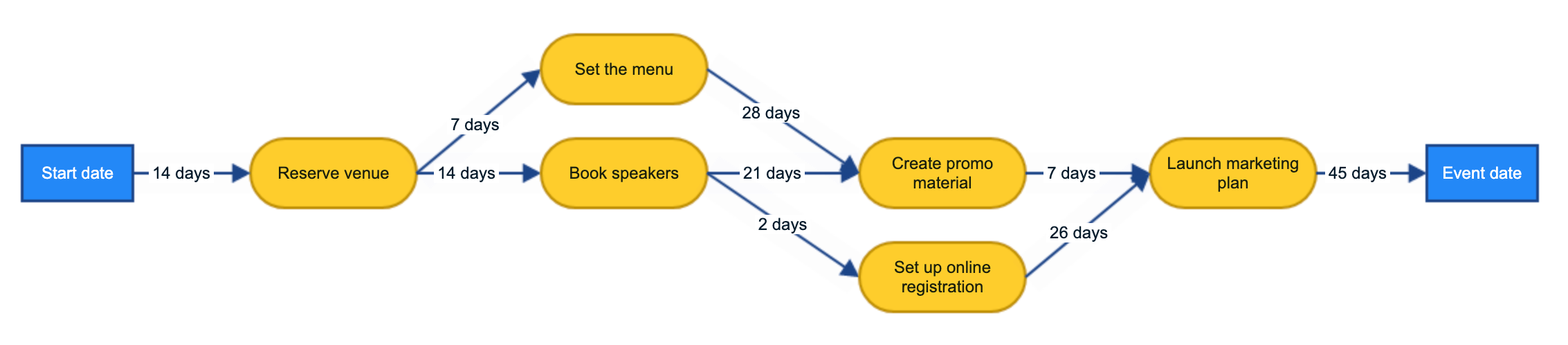
The creation of a website usually involves a copywriter, a graphic/web designer, a developer, a marketing manager (who usually acts as the project manager), and an enterprise-level manager.
Using Gliffy for Confluence, you can use the diagrams above to visualize who’s responsible for what, the order that things should happen in, what each team member needs, and when different areas and elements of the website need completing by. And you can do all of this directly in your Confluence space.
Back to topExecute Your Plan
As you move from the planning phase of your project to the execution phase, how do you stay organized and keep everyone updated about the status of key tasks and milestones?
Trying to execute your plan in emails, meetings, and even lots of Confluence pages, is messy and lacks transparency. It can also lead to information getting lost. That’s why teams use Jira, managing their work by visualizing it on agile boards.
Jira issues act as virtual sticky notes for each task, which you move across your board as you work on them. Jira offers Scrum boards for teams who want to work in timeboxed sprints, and Kanban boards for teams who want to continuously deliver on an ongoing project.
The Scrum methodology is especially helpful for a website project. The development and launch of the website could be generated as an overarching Jira issue called an epic; under the epic you’d then create tasks and subtasks for different team members. One task could be “Create a product page” and one subtask beneath that could be “Write copy for product page”.
Then, you’d move the tasks that you intend to work on from the backlog in Jira to the upcoming sprint, with the aim of completing those issues by the end of it. The building of a new website is the sort of Jira epic that’s likely to span several sprints, depending on its complexity.
Back to topReport Your Results
When it’s time to communicate the progress/results of your project to stakeholders, the best way to get them to understand the impact of your work at a glance is through a visual representation.
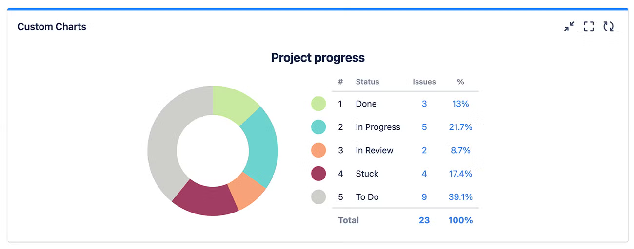
Custom Charts for Jira and Confluence allows you to create engaging, easy-to-understand reports on sprint progress, sprint velocity, assignee workloads, blockers, project health, and more. And you can make these reports directly on Jira dashboards and Confluence pages so that they’re easily seen by teams and managers.
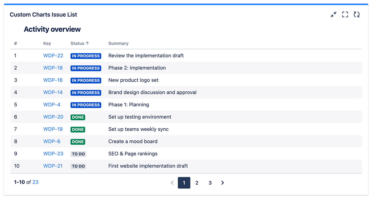
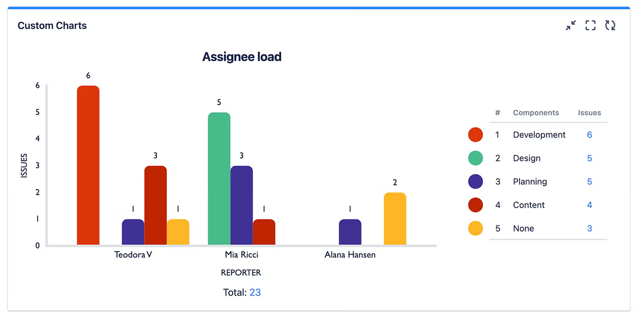
For example, your reporting dashboard for developing and launching a website in Jira could look something like this…
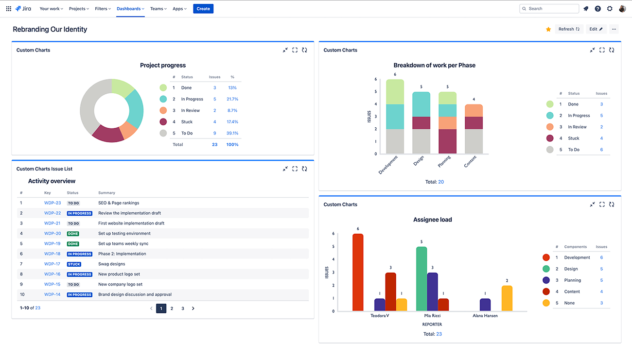
Add Custom Charts as a gadget to your Jira dashboard, or as a macro to your Confluence page, and you can make pie charts, bar charts, tile charts, and more out of your Jira data. Customizations include a full color picker, merging and renaming values, charting by 3rd party custom fields, showing/hiding segments, and custom ordering.
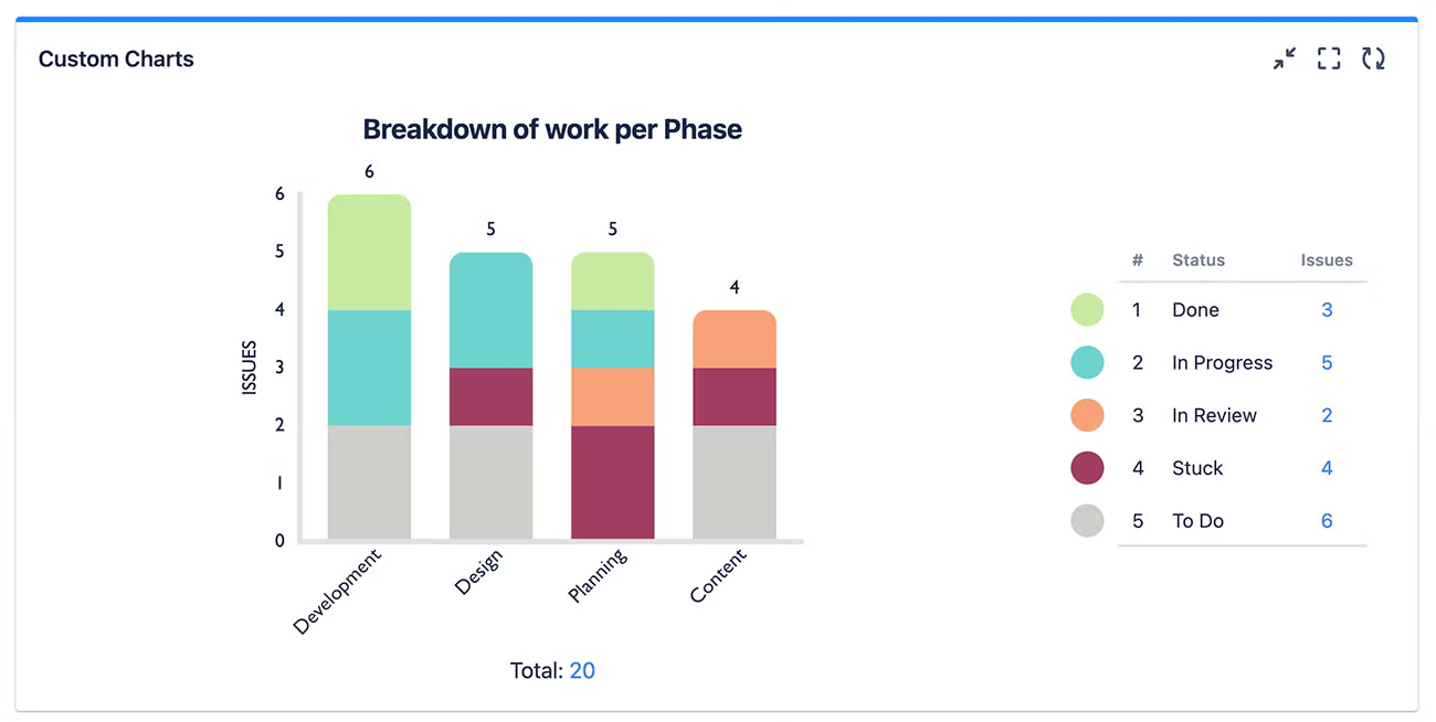
Your charts don’t just have to count issues; in fact you can calculate the sum or average of any number field in your instance. And you could, if you liked, report on a second variable, e.g. status of issues per phase/type of work, with a 2D stacked/grouped bar chart (below).
You can present these reports in Jira or in Confluence, depending where your stakeholders are.
Finally, you can evaluate the results of your project by holding a retrospective. Whether it’s just for a sprint or for a longer project, you can build Custom Charts on a Confluence page to show what worked and what didn’t.
Then you can collaborate on one of Gliffy’s retrospective templates for Confluence to reflect on what you’ve learned and how you can improve on processes for next time.
With effective reporting and evaluation, your team’s next project is set up for success.
Bring Your Next Project to Life With Custom Charts & Gliffy
When you’re getting ready to tackle your next project, try the methods we’ve discussed here to bring your project to life and visualize every step of the way.
You can try Custom Charts and Gliffy free for 30 days to see for yourself how a visual approach can transform your processes and help your team deliver the best results.