Blog
March 9, 2026

Imagine you’re presenting a new API integration to your engineering team.
With 15 minutes to explain how your system will “talk” to a third-party payment processor, do you spend 10 of them reciting dense paragraphs of text and watching as half the room loses focus?
Or do you show a simple diagram with request/response flows, authentication steps, and error handling that gets everyone aligned in half the time?
For technical teams, clear communication is a critical component of success, and when it comes to the complex interactions of APIs, words alone often fall short.
In this blog, we’ll dive into the importance of visualizing APIs and what that looks like with real-world examples.
Back to top
Why Visualizing APIs Is Non-Negotiable
Visual documentation transforms abstract concepts into tangible workflows, offering significant benefits that drive efficiency and build trust.
Benefits of API Visualization
More Impactful Presentations & Planning
A well-crafted API diagram communicates complex technical details far more effectively than a wall of text. It makes planning sessions more productive and presentations more engaging.
Building Stakeholder Trust
When you can visually articulate your API’s architecture, you demonstrate a deep understanding of its integration into a broader system, building confidence with both internal and (if applicable) external stakeholders.
Avoiding Misaligned Expectations
Visuals create a single source of truth that transcends jargon and individual interpretation. This alignment is crucial for preventing the “telephone game” where requirements are misinterpreted as they pass through different teams.
The High Cost of Poor API Communication
Failing to communicate API functionality clearly carries substantial risks, both internally and, for client-facing teams, externally. These consequences directly impact project timelines, budgets, and business relationships.
Time
Without visual API documentation, teams spend hours in 'alignment meetings' trying to verbally explain what could be shown in a diagram in 30 seconds.
Engineers build to the wrong specs. QA tests against outdated assumptions. Product must rescope features. Before you know it, a 2-week project becomes 6 weeks, leading to delays in delivery and release.
Customers
In technical sales, the ability to quickly diagram your API architecture during a discovery call often determines whether you advance to POC or get ghosted. Prospects want to see you understand their integration complexity; not just hear you claim you do. (very true for me as an SE)
Back to topHow APIs Work: A Real-World Example with a Weather App
To understand the power of API visualization, let’s consider a common scenario: a mobile application that needs to display the current weather to its users. The application does not store weather data itself; rather, it requests it from a third-party weather API.
This single integration involves multiple team members, each with distinct concerns:
- The Mobile App Developer needs to know what data to request, how to structure the request, and what format the response will be in.
- The Backend Engineer must ensure API calls are efficient and do not exceed rate limits imposed by the third-party service.
- The Product Manager needs to understand the user experience implications if the API is down or returns an error.
- The UX Designer requires information on API response times to design appropriate loading states and error messages.
A sequence diagram created in Gliffy can provide immediate clarity for the entire team. It maps out every step of the process, including potential failure points.
This sequence diagram created with Gliffy's AI diagramming feature can provide immediate clarity for the entire team. It maps out every step of the process, including potential failure points.
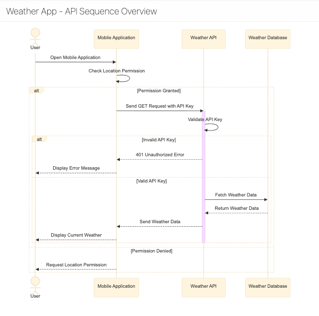
- User Action: The user opens the mobile application.
- Permission Check: The app verifies it has permission to access the user's location.
- API Request: The app sends a GET request to the Weather API endpoint, including the validated API key.
- API Key Validation: The Weather API checks if the provided key is valid.
- Error Path: If the key is invalid, the API returns a 401 Unauthorized error.
- Success Path: If the key is valid, the process continues.
- Data Retrieval: The Weather API fetches the relevant weather data from its database.
- API Response: The API sends a response back to the app containing the weather data.
- Display Data: The app parses the response and displays the current weather to the user.
The diagram also makes it easy to define and understand error handling protocols:
- API Downtime: If the API is down, the diagram shows a path where the app displays cached weather data along with a message like, "Data may be outdated."
- Invalid API Key: If a 401 error is returned, the app shows a message stating, "Unable to load weather."
- No Internet Connection: If the user's device is offline, the app only shows cached data.
With this single diagram, every team member instantly understands what data is sent, what is received, where failures can occur, and how the system should respond. No lengthy meetings or confusing documents are required.
Back to topMake API Diagramming Effortless with Gliffy
Communicating API functionality shouldn’t be a roadblock to progress. Gliffy makes it simple to visualize your API directly within Confluence, empowering your teams to build with confidence and precision.
If you’re ready to transform your API planning and documentation from a source of confusion into a driver of alignment, here’s how to get started:
- Use Templates: Leverage Gliffy's sequence diagram templates to accelerate the creation of API flows.
- Add Interactivity: Add interactive links to connect elements in your diagrams directly to your comprehensive API documentation pages in Confluence.
- Share With Your Team: Share your diagrams with the team to gather feedback and ensure everyone is aligned from the start.